UX Decisions | Sign In / Sign Up process using a seperate page or popover dialog
UX Decisions | Sign In / Sign Up as page or popover dialog
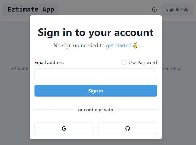
You likely use a login page and process every day. It reaches from logging in to your computer, to logging in to your favourite site account. To make this everday task a easy and flawless as possible we have to follow some basiscs rules like making clear where to login and what information needed from the user.
Using a modal dialog or a seperate page?
Implementing a login mechanism for a new web app I stumbled over the question if it is better to have a modal dialog to login the user or to have a seperate page containing the login form.
How do other sites solve this?
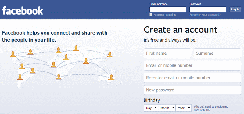
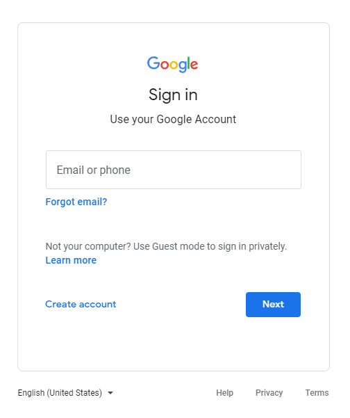
Google, Amazon, Facebook and many other other site use a seperate page show the login form. Often this is needed as the site is designed to be used as a logged in user (like Facebook or Twitter).
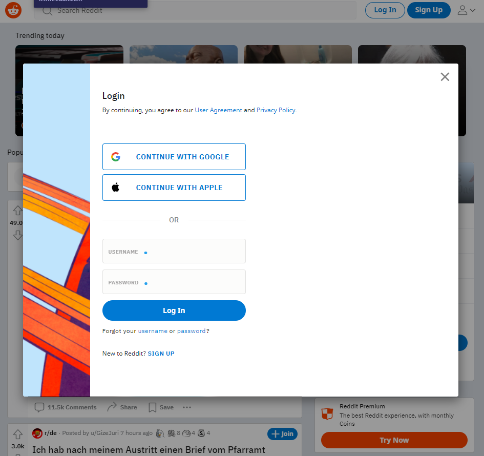
However, even though they are so common place it continues to amaze me that there are still so many badly designed login processes and login pages out there. Ensure that your login page doesn’t present an unnecessary obstacle to your users by following these 10 top tips for designing a better login page and process.